Recovery Room
Designed an e-commerce experience for Recovery Room, a brand offering professional-grade recovery tools for athletes, fitness enthusiasts, and healthcare practitioners.
I was responsible for designing the user interface, translating an established UX strategy and site structure into a clear, intuitive, and visually cohesive experience that supports product discovery and user decision-making.
recoveryroom.caProject Brief
I was tasked with separating a single website—360 Athetics and creating a new website—Recovery Room—to better serve their different audiences. The original website combined multiple offerings under one brand, making it difficult to communicate clear value propositions to different audiences. The objective was to create clear messaging, differentiated offerings, and a more focused shopping experience.
Area of Opportunity
The existing experience on the 360 Athletics website made it difficult for users to navigate and identify the right products—particularly for those unfamiliar with recovery tools or brand-specific terminology.
A new website could:
- Simplify product discovery.
- Improve clarity of offerings and overall brand positioning.
- Enable users to quickly identify solutions tailored to their specific needs.
Phase 1: Goals
Buisness Goals
- Establish distinct brand identities by separating Recovery Room and 360 Athletics.
- Improve product visibility and discoverability.
- Create a clearer navigation structure.
Design Goals
- Create an e-commerce experience that allows user find the right recovery products, regardless of their prior knowledge.
User Goals
- Easily find products based on injury, sport, or specific need.
- Understand how products support recovery and performance.
Phase 2: Research & Key Insights
header
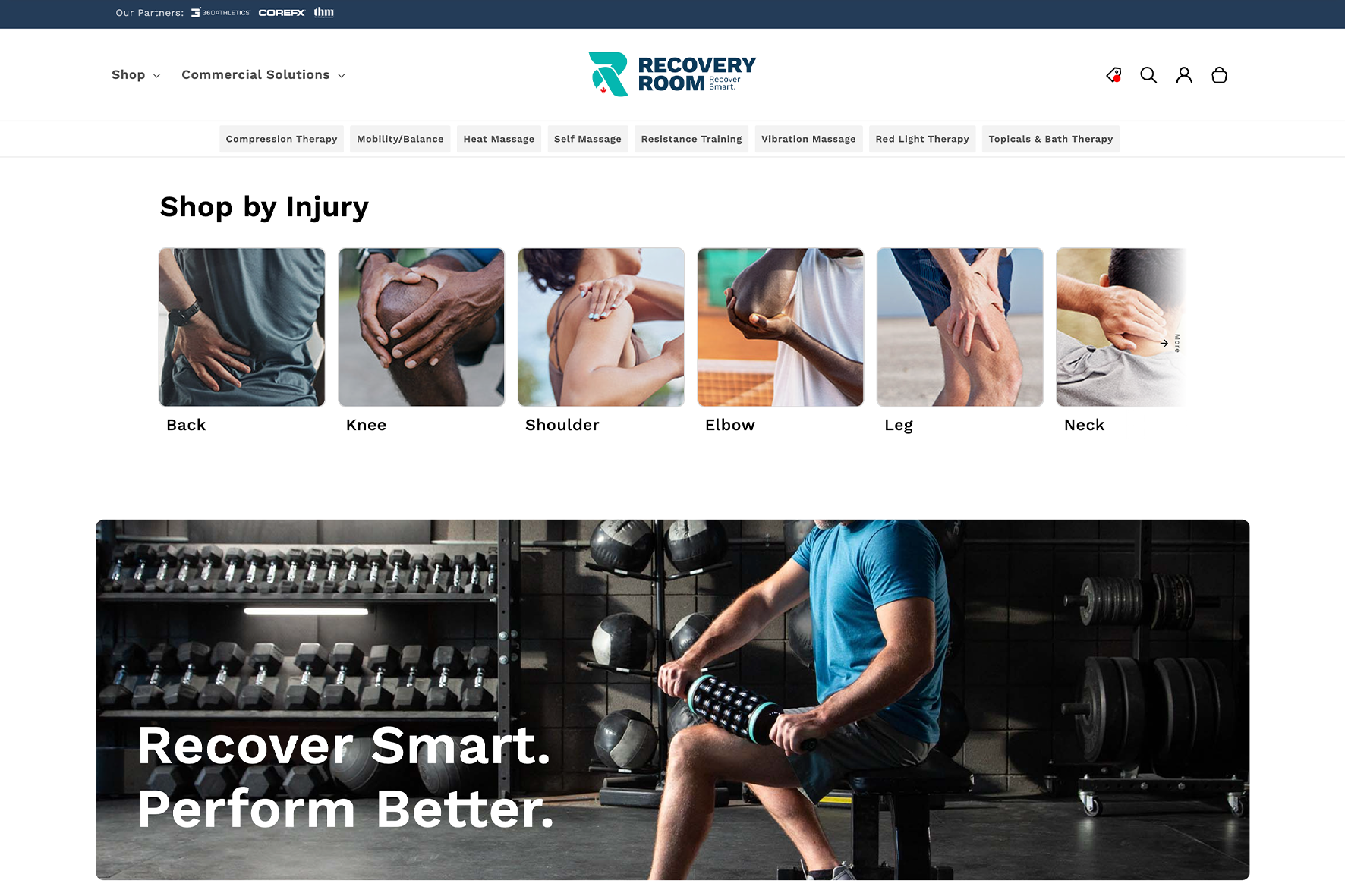
The UX direction and research identified a key gap in the market:most competitors structured their e-commerce experiences around product categories or brands, rather than user needs.
Key Insights
Users think in terms of pain points, not products. For example, someone experiencing knee pain is more likely to search for a solution to that issue than a specific brand or tool.
This insight informed a navigation system centrered around:
- Injury
- Activity
- Traditional Product Categories
Phase 3: Design Approach
My role focused on translating this UX framework into a high-fidelity interface that enhances clarity, hierarchy, and usability.